Bringing Data To Life
Visualising COVID-19 data, aka, what the heck is a Choropleth?

Update: the behind-the-scenes details for the DIY folk is now available.
Choropleths for Days...
Monday the 11th October, 2021, was "Freedom Day" for Sydney (or as a few hicks like to call it, "NSW"). It was the first dramatic step in the reversal of government restrictions on movement and congregations. The restrictions were put in place 100 or so days ago to limit the spread of COVID-19, in its current form amid the Delta variant outbreak.
The on-going pandemic, amongst so many impacts, has been stunning in the way it has delivered a common interest in hitherto obscure topics that nonetheless drive our world. Epidemiology, vaccines, virus transmission, supply chains, business sentiment, QR codes, scientific modelling and... counting things.
I really enjoy counting things, so its nice to have counting things be such as regular activity on prime time telly and in casual conversation. Although I have to admit, even I'm starting to glaze over at the daily case number updates, and growing weary of trying to make sense of the silly fresh prose that comes out each day trying to make a narrative out of numbers. Day after day of lyrical tricks and meaningless comparisons have been growing strained, and when this clanger appeared in our region's major newspaper the other day, I figured we'd probably reached peak usefulness of this approach:
Tough gig trying to make prose from daily case numbers. The local rag has been getting a little strained with their efforts. This one is the best stretch yet.
— Heath Raftery (@HeathRaftery) October 4, 2021
"Cessnock and Lake Macquarie had 40 cases between them, more than double the daily case number of any other Hunter LGA."
Unless you're counting objects and you could reasonably picture a pile with that number of objects in it, numbers start getting very abstract. Abstract numbers in isolation are close to meaningless. We simply can't make sense from isolated numbers of things we can't count. Instead, they take form in comparison. Without comparison we can't draw sensible conclusions about trends and significance.
In understanding COVID-19 case numbers, I was interested in comparisons to previous days and to relevant LGAs. I found some great tables, some excellent statistics, some really thorough plots and some fascinating analysis. I even found some very nice interactive tools here and here.
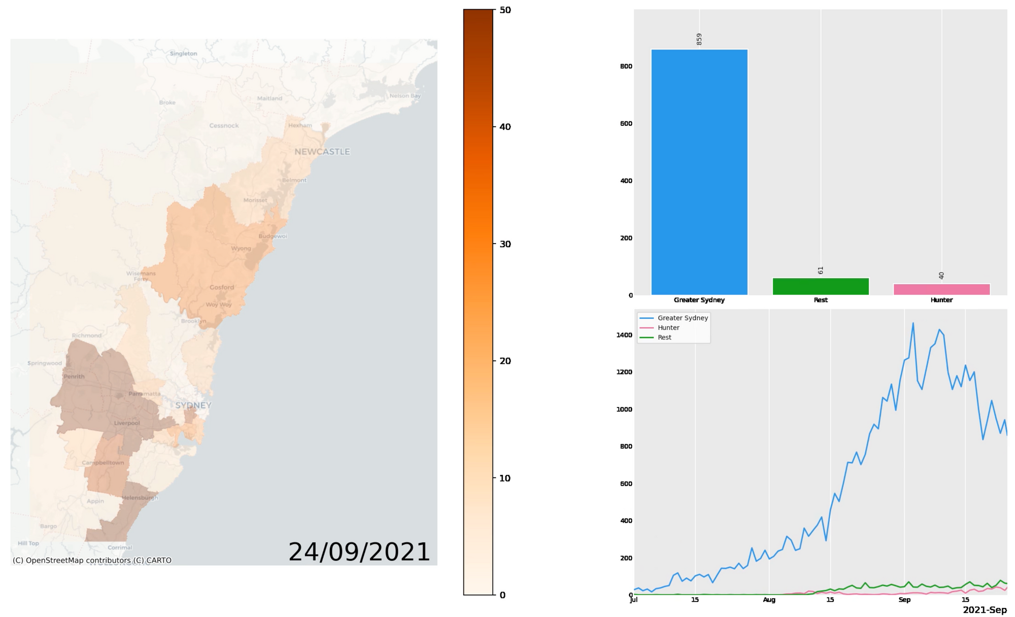
But I still didn't have the full picture. So I blew the dust off some data visualisation tools in Python, and tried to paint a more useful picture. The exploration was the most illuminating part, and I'll capture that in detail my next post, but for now, here's the final visualisation I came up with.
The video is embedded as is (instead of "adorning" it with the looping/control-less/ad laden crap from a video host) because you'll probably want to scrub back and forward a little, particularly in the most recent week of data.
What do you see? Has the curve in Sydney taken its course in the Hunter yet? Personally, I think the recent change to restrict travel to within regional or non-regional is very sound.
Notes on Interpretation
- Note that all these are just case numbers - they make no useful statement about risk (which entails many more factors), only some rough proxy of spread.
- All case number data is as published by NSW Health.
- The colour scale used in the map is capped at 50 cases/day/LGA. Any more than that and the colour stays the same.
- The significant events and their dates in the line graph mostly came from here, and piecing a timeline together from the referenced newspaper articles. The Commonwealth has put together a great chronology for 2020, but it seems no such effort has been made for 2021 yet.
- Just as I was publishing this article, I realised that the reference that kicked this investigation off (the Newcastle Herald) was reporting different numbers to those that appeared in my charts. To get to the bottom of it, I ended up creating a side-by-side comparison, shown here:
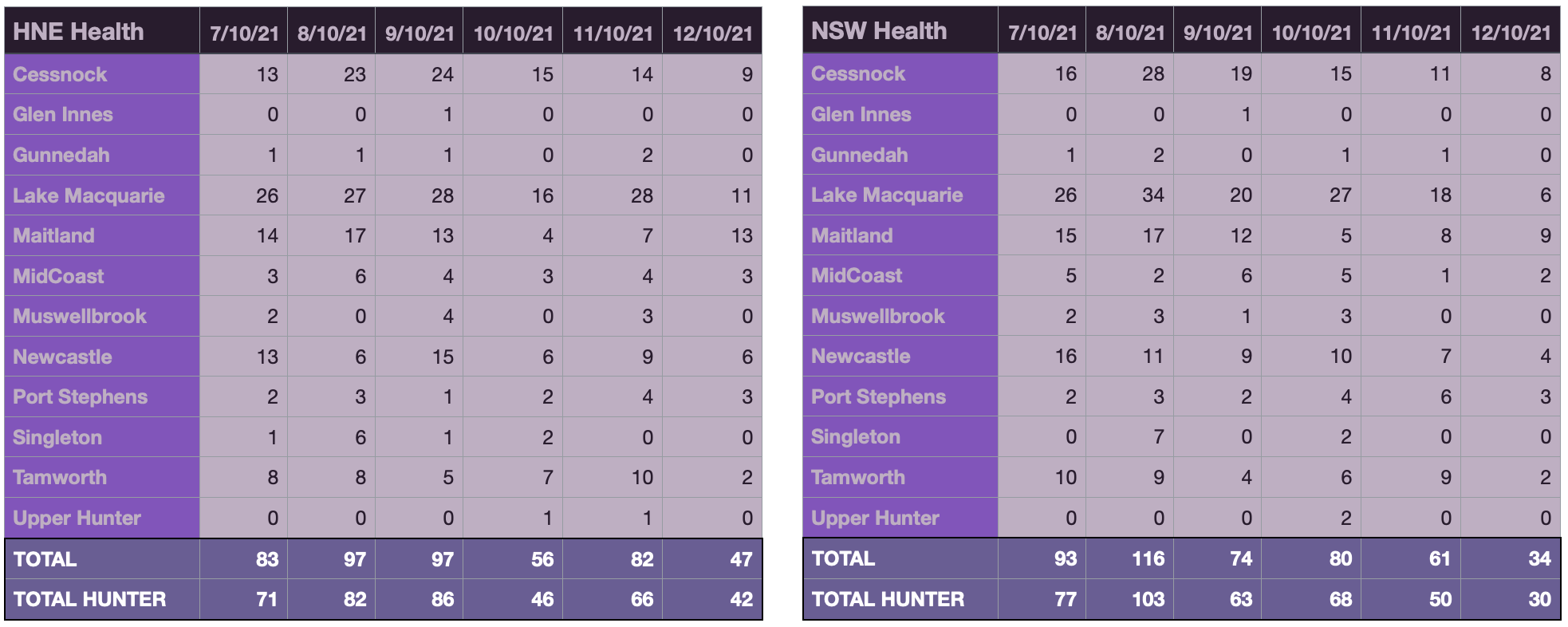
I can't be sure why they're different (but I vaguely remember someone does - please drop me a line if you know!), but I can see that:
- The Newcastle Herald reports on data from Hunter New England (HNE) Health, and does so accurately. However, they usually use the term Hunter when they're referring to the Hunter New England Health District. The HNEHD includes both the Hunter region and the New England region.
- HNE Health report their data for the 24hr period to 8pm. I'm not sure what period NSW Health uses.
- HNE Health annotate their data with the day of the announcement, which is the day after the cases, while NSW Health typically annotate with the day of the cases. In the table above, the date is the day of the announcement. In the graphs in the video the date is the day of the cases.
- Even with the day and the regions discrepancies taken into account, the numbers are not the same. They work out to be very close in aggregate, so I suspect that the NSW Health simply reflects corrections not available at the time the HNE Health announcements are made, but I don't know.