The Sting in the Tail
The danger of a daily average view is that price volatility is viewed as an outlier, not as the fundamental feature that it is.


Much has been said of the falling wholesale electricity price in the Australian grid. Low, and often negative, day time wholesale prices are driving lower average wholesale prices across the National Electricity Market.
At the other end of the scale too, an oft cited feature of the NEM is it has one of the highest market caps in the world: generators are allowed to bid up to $20,300/MWh. And on the rare occasions when no other option exists, that's what everyone pays. This feature provides a clear and attractive signal for market participants to ensure they can provide generation when the grid needs it most.
In theory this is a self-correcting force - as the price cap incentivises investment in supply, the opportunities to command a premium for it wane. But in fact, the volatility has sort of just stuck around.
In this article I explore the surprising impact that very rare, very high prices have on the overall wholesale price.
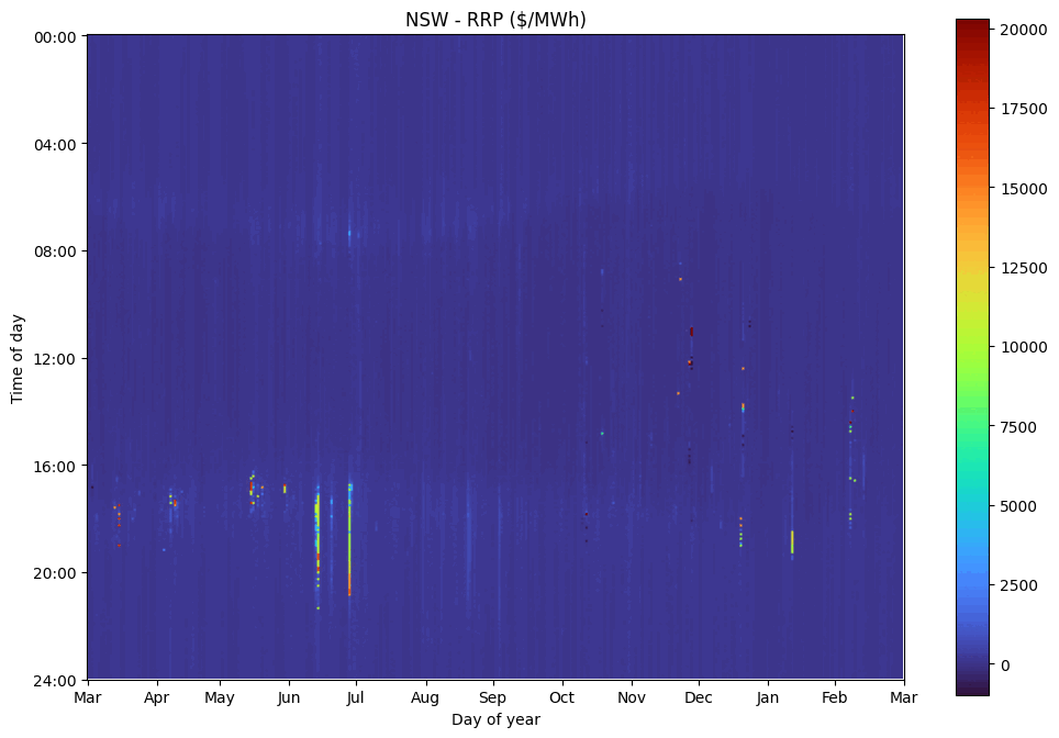
I'm using, for the basis of my study, the Aggregated Price and Demand Data that AEMO makes available. It shows the Demand and Regional Reference Price for each region (State), in each 5 minute trading interval. I consider the last 12 months of data to now (March 2026).
Time Domain Analysis
As a warm up, here are the average prices in each region for the 12 month period.
| NSW | QLD | SA | TAS | VIC | |
|---|---|---|---|---|---|
| Average MWh | $101.45 | $80.26 | $92.86 | $92.52 | $75.25 |
| Average MWh, weighted by demand | $119.48 | $90.71 | $130.50 | $98.67 | $94.34 |
The simple average of each 5 minute interval is shown in the first row, but it's fairly meaningless. The money actually transacted is relative to the demand in that interval, so average price is usually best considered weighted by demand, as shown in the second row. The elevated figures suggest that low prices are correlated with low demand and/or high prices with high demand, so factoring in demand increases the average.
Okay, now let's take a look at the trend over time.
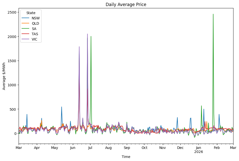
When averaged over whole days, the price:
- is mostly around $100/MWh,
- is noticeably suppressed after September,
- occasionally spikes in mid Winter and mid Summer, and
- dips in late December.
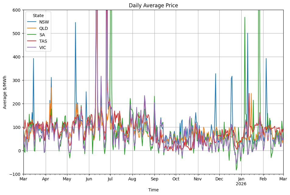
Zooming into to the -$100/MWh to $600/MWh range shows these features more clearly.
Statistical Analysis
Looking at this in the time domain is common and familiar. But electricity is paid for 24/7, and averages inherently downplay the role of volatility. So let's look at the overall distribution of price:
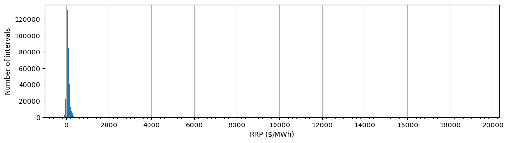
The histogram shows that price is very tightly clustered. Each tick mark is $200/MWh, so the vast majority of intervals have a price less than $400/MWh.
Using a log scale for the y-axis reveals the detail outside the main cluster.
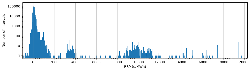
So with a fine enough comb we can see there are many tens of intervals with prices in excess of $3000/MWh, right up to the market cap.
Apart from providing a nice payday for those generators that participate, do these rare high price intervals have much effect?
The AER publish a popular analysis on price bands that ostensibly helps answer that question. For this purpose, I believe it does a very poor job.
A much clearer picture arises if we consider the contribution of each interval to the average (demand-weighted) price, ordered by the price in that interval. That way we can see how intervals at each price point make up the overall price.
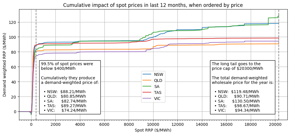
Here is that view, plotted for each region. Several revealing details jump out:
- The impact of negative prices is minor. Negative prices tend to occur when demand is low. Very low price intervals reduce the number of intervals that do meaningfully add to the price (a fact not demonstrated in this visualisation). But the cumulative, demand-weighted effect of intervals with a price less than zero is only about -$4/MWh.
- The bulk of the overall price is set by intervals with a price under $400/MWh. This is not surprising, since that constitutes 99.5% of the intervals!
- What is surprising is that the other 0.5%, the long tail, does have a significant effect.
The impact of the long tail is most striking in SA. The first 99.5% contributes $82.74/MWh, and the last 0.5% contributes a further $47.76/MWh! Indeed, the last $14/MWh comes from the handful of intervals with price above $19000/MWh. I suspect these occurred on this year's fateful Australia Day scorcher, when South Australia's batteries ran low.
At the other end of the scale is QLD and TAS. For what are probably very different reasons, the long tail in both states contributed less than $10/MWh. Meanwhile, NSW and VIC see contributions of $31.27/MWh and $20.10/MWh respectively.
Conclusion
The challenge for market operators is to determine how much volatility the market should bear. At the end of the day the retail market must hedge against volatility to provide consumers a fixed price, so volatility drives prices up. Imagine if two "Australia Day" events had occurred instead of one - the average price could have easily been another $14 higher.
Weather events are largely outside the regulator's controls. But as the world moves towards more variable renewable energy generation, there's one obvious way we can capitalise on the near-zero marginal costs - complement with storage.
While ever we take the daily average view, we'll inhibit storage investment to the few hours needed to flatten the duck curve. Perversely, lack of storage as a load inhibits renewable energy generation investment too, as the time-correlated output drives prices towards zero.
The danger of a daily average view is that price volatility is viewed as an outlier, not as the fundamental feature that it is.